library(tidyverse)
library(readr)
library(kableExtra)
library(data.table)
library(stargazer)Cars Project
Loading libraries
Reading the excel file
df <- read_table("cars.xls")Getting overview of the data
kbl(head(df),format    = "latex",
caption = "Overview of the data",
      booktabs  = T) %>%
kable_styling(latex_options = "scale_down",font_size = 26)
Question 1 & Question 2
We start by solving question number 1 and 2 in 1 code chunk in Rmarkdown. Below code can be run in R code chunk for running shiny app on local server.
library(shiny)
library(ggplot2)
library(plotrix)
library(RColorBrewer)
library(readr)
library(tidyverse)
library(plotly)
library(data.table)
library(summarytools)
library(pointblank)

df  <- read_table("cars.xls")

ui <- shinyUI(fluidPage(

  # Application title
  titlePanel("Car Dataset Analysis"),

  # Sidebar with a slider input for number of bins
  sidebarLayout(
    sidebarPanel(
      selectInput("X_variable", "X Variable:",
                  c("No of Cylinders" = "Cylinders",
                    "Type of car" = "Type",
                    "Engine Size" = "EngineSize",
                    "Fuel Tank capacity" = "Fuel.tank.capacity",
                    "Origin of the car"="Origin",
                    "Prices"="Price",
                    "Rev /min"="RPM",
                    "Weight of car"="Weight",
                    "MPG city"="MPG.city",
                    "Horsepower of car"="HorsePower",
                    "Passengers capacity"="Passengers",
                    "Length of car"="Length",
                    "Manufacturer of car"="Manufacturer",
                    "Model of car"="Model" )),
      selectInput("Y_variable", " Y Variable:",
                  c("No of Cylinders" = "Cylinders",
                    "Type of car" = "Type",
                    "Engine Size" = "EngineSize",
                    "Fuel Tank capacity" = "Fuel.tank.capacity",
                    "Origin of the car"="Origin",
                    "Prices"="Price",
                    "Rev /min"="RPM",
                    "Weight of car"="Weight",
                    "MPG city"="MPG.city",
                    "Horsepower of car"="HorsePower",
                    "Passengers capacity"="Passengers",
                    "Length of car"="Length",
                    "Manufacturer of car"="Manufacturer",
                    "Model of car"="Model" )),
      checkboxInput('simple_regression','Run Simple Linear Regression'),
      checkboxInput("pred_type", 'Run Multiple Linear Regression'),
      checkboxInput("line","Show best fit line?", T),
      checkboxInput("means","Show mean of X and Y?"),
      checkboxInput("ant","Show regression equation?", F),
      checkboxInput("corr", 'View Correlation Plot'),
      conditionalPanel(
        condition = "input.pred_type == true",
        uiOutput('predictors')
      ),
      conditionalPanel(
        condition = "input.pred_type == false",
      ),

      helpText("Note: By default, Multiple Linear Regression will include the
      variable selected in
               dropdown above.")),

    mainPanel(
      tabsetPanel(type="tabs",

      tabPanel("Plots",
        plotOutput("main_plot")),

      tabPanel("Regression results",
               h4("Please click the checkbox on side bar"),
               conditionalPanel(
          condition = 'input.simple_regression==true',
          h2("Simple Linear Regression Summary"),
          verbatimTextOutput("simple_summary")
        ),
        conditionalPanel(
          condition = 'input.pred_type==true',
          h2("Multiple Linear Regression Summary"),
          verbatimTextOutput("multiple_summary")
        )),
      tabPanel("Boxplots",
               plotOutput("hist_plot")),

      tabPanel("Regression plot",
               h4("Click on checkbox in side bar for best fit line
                  with equation"),
               plotOutput("scatter"),
               uiOutput("equation")),

      tabPanel("Summary Statistics",dataTableOutput("mytable")),


      )
    )
  )
))

server <- shinyServer(function(input, output) {

  data <- df


  data$Model <- factor(data$Model)
  data$Manufacturer <- factor(data$Manufacturer)
  data$Origin <- factor(data$Origin)
  data2 <- data.frame(data)

  choices <- c("No of Cylinders" = "Cylinders",
               "Type of car" = "Type",
               "Engine Size" = "EngineSize",
               "Fuel Tank capacity" = "Fuel.tank.capacity",
               "Origin of the car"="Origin",
               "Prices"="Price",
               "Rev /min"="RPM",
               "Weight of car"="Weight",
               "MPG city"="MPG.city",
               "Horsepower of car"="HorsePower",
               "Passengers capacity"="Passengers",
               "Length of car"="Length",
               "Manufacturer of car"="Manufacturer",
               "Model of car"="Model" )

  output$main_plot <- renderPlot({
    x <- data2[[input$X_variable]]
    y <- data2[[input$Y_variable]]

    if(is.numeric(x) & (is.numeric(y))){
      ggplot(data2, aes(x = .data[[input$X_variable]],
                        y=.data[[input$Y_variable]])) +
        geom_point(aes(shape = input$Y_variable, color=input$Y_variable,
                       size=input$Y_variable))  +
 xlab(names(choices)[choices == input$X_variable]) +
        ylab(names(choices)[choices == input$Y_variable]) +
      theme(panel.grid.major = element_blank(),
            panel.grid.minor = element_blank(),
            panel.background = element_blank(),
            axis.line = element_line(colour = "black"),
            plot.title = element_text(colour = "black",
                                      size = 20,
                                      face = "bold", hjust = 0.5),
            plot.caption = element_text(color = "black",
                                        size = 12, face="bold.italic"),
            plot.subtitle = element_text(size = 13, hjust = 0.5),
            legend.title = element_blank(),
            axis.title = element_text(size=12)) +
      labs(title = "Relation between different variables of car dataset",
           caption = paste(names(choices)[choices == input$X_variable],"vs",
                           names(choices)[choices==input$Y_variable]))
        }

    else if ((is.factor(x) &
              is.numeric(y)) |
             (is.factor(y) &
              is.numeric(x))){
      ggplot(data2, aes(x = .data[[input$X_variable]],
                        y=.data[[input$Y_variable]])) +
        geom_boxplot(aes(shape = input$Y_variable, color=input$Y_variable,
                         size=input$Y_variable)) +
        xlab(names(choices)[choices == input$X_variable]) +
        ylab(names(choices)[choices == input$Y_variable]) +
        theme(panel.grid.major = element_blank(),
              panel.grid.minor = element_blank(),
              panel.background = element_blank(),
              axis.line = element_line(colour = "black"),
              plot.title = element_text(colour = "black",
                                        size = 20,
                                        face = "bold", hjust = 0.5),
              plot.caption = element_text(color = "black",
                                          size = 12, face="bold.italic"),
              plot.subtitle = element_text(size = 13, hjust = 0.5),
              legend.title = element_blank(),
              axis.title = element_text(size=12)) +
        labs(title = "Relation between different variables of car dataset",
             caption = paste(names(choices)[choices == input$X_variable],"vs",
                             names(choices)[choices==input$Y_variable]))
  }
 else {ggplot(data2, aes(.data[[input$X_variable]])) +
     geom_bar(aes(fill=input$X_variable))  +
        xlab(names(choices)[choices == input$X_variable]) +
      ylab(names(choices)[choices == input$Y_variable]) +
        theme(panel.grid.major = element_blank(),
              panel.grid.minor = element_blank(),
              panel.background = element_blank(),
              axis.line = element_line(colour = "black"),
              plot.title = element_text(colour = "black",
                                        size = 20, face = "bold",
                                        hjust = 0.5),
              plot.caption = element_text(color = "black",
                                          size = 12, face="bold.italic"),
              plot.subtitle = element_text(size = 13, hjust = 0.5),
              legend.title = element_blank(),
              axis.title = element_text(size=12)) +
        labs(title = "Relation between different variables of car dataset",
             caption = paste(names(choices)[choices == input$X_variable],"vs",
                             names(choices)[choices==input$Y_variable]))

    }
    })

  output$hist_plot <- renderPlot({

  ggplot(data2)+aes_string(x=input$X_variable,y=input$Y_variable)+
    geom_boxplot(aes(fill=input$Y_variable),position='dodge')+
    xlab(names(choices)[choices == input$X_variable]) +
    ylab(names(choices)[choices == input$Y_variable])+
    theme(panel.grid.major = element_blank(),
          panel.grid.minor = element_blank(),
          panel.background = element_blank(),
          axis.line = element_line(colour = "black"),
          plot.title = element_text(colour = "black",
                                    size = 20, face = "bold", hjust = 0.5),
          plot.caption = element_text(color = "black",
                                      size = 12, face="bold.italic"),
          plot.subtitle = element_text(size = 13, hjust = 0.5),
          legend.title = element_blank(),
          axis.title = element_text(size=12)) +
    labs(title = "Relation between different variables of car dataset",
         caption = paste(names(choices)[choices == input$X_variable],"vs",
                         names(choices)[choices==input$Y_variable]))
  })

  output$mytable <- renderDataTable({
    dfSummary(df, plain.ascii = F, style = 'grid',round.digits = 2,
              method = 'render',
              headings = T,
              bootstrap.css = FALSE,display.labels = TRUE,
              graph.magnif = 0.75, graph.col = F,
              valid.col = FALSE, tmp.img.dir = "/tmp")
  })

  data <- reactive({data2[,c(input$X_variable,input$Y_variable)]})

  output$scatter <- renderPlot({
    plot(data())

    if(input$line) {
      abline(lm(get(input$Y_variable)~ get(input$X_variable), data=data()),
             col="dark blue")
    }
    if(input$means) {
      abline(v = mean(data()[,1]), lty="dotted")
      abline(h = mean(data()[,2]), lty="dotted")
    }

  })
    output$equation <- renderPrint({
      if(input$ant) {
        model <- lm(get(input$Y_variable)~ get(input$X_variable),data=data())
        txt = paste("The equation of the line is = ",
                    round(coefficients(model)[1],0)," + ",
                    round(coefficients(model)[2],3),"X + error")

        sprintf(txt)
      }

    })

  output$predictors <- renderUI({
    predx <- choices[!choices %in% input$X_variable]
    checkboxGroupInput("predx", "Choose Predictor Varaible(s)", predx)
  })

  output$simple_summary <-renderPrint({
    df1 <- data.frame(data2[,input$X_variable])
    names(df1)[1] <- names(choices)[choices == input$X_variable]
    df1$Price <- df$Price
    lm.simple <- lm(Price~., data = df1)
    summary(lm.simple)
  })
  #
  output$multiple_summary <-renderPrint({
    if (is.null(input$predx)) {
      df1 <- data.frame(data2[,input$X_variable])
      names(df1)[1] <- names(choices)[choices == input$X_variable]
    } else {
      df1 <- data2[,names(data2) %in% c(input$predx, input$X_variable)]
      for(i in 1:length(names(df1))){
        names(df1)[i] = names(choices)[choices == names(df1)[i]]
      }
    }
    df1$Price <- df$Price
    lm.multiple <- lm(Price~., data = df1)
    summary(lm.multiple)
  })

})
shinyApp(ui, server)- Using Monte Carlo simulations, you should attempt to predict the average price of a car using this dataset. You have to use at least two different regression models you have previously fit for the dependent variable “Price” (e.g. find the best regression models for the variable price. Generate Monte Carlo simulations for the full and the reduced regression models to predict the average car price). Discuss each model performance.
Question 3
We have to use monte carlo method for 2 regression models based on dependent variable price. Lets load the dataset again.
df <- read_table("cars.xls")The steps we have to follow are
Select full regression model based on many independent features for predicting price (One of the model shape can be like Price~Origin+Type+EngineSize+Fuel.tank.capacity+RPM+Weight+MPG.city+ Cylinders+Horsepower+Passengers+Length+Manufacturer+Model).
Run monte carlo simulation on all regression models.
Get the best regression model for predicting price.
For following the above steps we can start by using a multiple linear regression. We have included multiple linear regression in our shiny app as well where we can select as many as possible independent variables by clicking the checkbox in the app.
Here we start by choosing all models which are best fit for predicting Price of the car. We select all columns except Price to apply linear regression. Afterwards with the help of lapply function from base R we apply a function over the list of columns with data. It is followed by sapply which has a function for ols_mallows_cp application from olsrr package on the linear regression model. It accepts two arguments of model and full model which are given by the variable names full_model and my_models. Afterwards we show the top 10 rows for the models. We get approx 8192 different models for predicting price of the car with all other columns as independent variables. In the end of code chunk show 1 model out of all models.
library(rje)
library(olsrr)

x <- powerSet(colnames(df[,-2]))
full_model <- lm(Price ~ ., data=df )

my_models <- lapply( x, function(numbersofcol) {
    d_iteration <- df[,c( "Price", numbersofcol), drop=FALSE]
    return( lm(Price ~ ., data = d_iteration ) )
})

Cp_vec <- sapply( my_models, function(mnv) {
    ols_mallows_cp(mnv, full_model )
})

TenInd <- head( order( Cp_vec ), n=10 )

TenCp <- head( sort( Cp_vec ), n=10 )

TenSets <- x[ TenInd ]

my_models[[ TenInd[1] ]]
Call:
lm(formula = Price ~ ., data = d_iteration)

Coefficients:
(Intercept)
      19.37
After getting a large number of models, we apply the monte carlo simulation to get the best model. We consider \(\beta_{1}\) as the slope of the model. Here we are interested in finding the estimators for the best model. We start by picking up 100 simulations and setting the 3 estimators of beta1 ,2 ,3. Each simulation will have 100 data points. After setting the parameters of regression model we defined a function with parameters of group of data and finally draw a histogram showing the best value of estimator for the best regression model. Further code explanation is given in the code chunk below with comments.
# Number of iterations
iterations <- 100

# data points in each simulation
points_in_sim <- 100

alpha = 2.2
beta_1 = 0.5
beta_2 = 0.3
beta_3 = 0.2

fit_reg <- function(group, group_col, df, reg_formula){

  mod <- my_models
  return(mod[["coefficients"]][2])

}

# Generate variables
integrs <- rep(iterations*points_in_sim, alpha)
vectorx1 <- rnorm(iterations*points_in_sim , 2, 1)
error_vector <- rnorm(iterations*points_in_sim, 0,1)

#fitting a cubic function.

vectorx2 <- vectorx1^2
vectorx3 <- vectorx1^3

# creating a group indicator for each simulation and saving
# as dataframe to fit regression

group <- rep(c(1:100),each=100)

iterations_dataframe <- as.data.table(cbind(group, integrs,
                                            vectorx1, vectorx2, vectorx3))
names(iterations_dataframe) <- c("group","integrs",
                                 "value1", "value2", "value3")

# changing rownames
iterations_dataframe[["y"]] <- iterations_dataframe[["integrs"]] +
  beta_1 * iterations_dataframe[["value1"]] +
  beta_2 * iterations_dataframe[["value2"]] +
  beta_3 * iterations_dataframe[["value3"]] + error_vector

# defining a data.table subseting value of every group
iterations_datatable = iterations_dataframe[, list(data=list(.SD)), by=group]

# usijg datat.table to fit regression and definign new column by using := method

iterations_datatable[, model := lapply(data, function(x)
  lm(y ~ value1+value2+value3, x)[["coefficients"]][2])]

summary_stats <- iterations_datatable[, model := lapply(data, function(x)
  lm(y ~ value1+value2+value3, x)[["coefficients"]][2])]

stargazer(summary_stats[[2]][[1]],type='text')
======================================================
Statistic  N     Mean    St. Dev.    Min       Max
------------------------------------------------------
integrs   100 10,000.000  0.000    10,000     10,000
value1    100   2.237     1.045    -0.119     5.044
value2    100   6.088     4.788     0.003     25.441
value3    100   18.345    20.741   -0.002    128.323
y         100 10,006.660  5.984   9,999.404 10,034.340
------------------------------------------------------
# getting data back in the form of a column. extracting ti as vector to plot
hist(iterations_datatable[,model[[1]], by=group][["V1"]], breaks=50, col="red",
main="Distribution of the estimator for beta1",xlab="iterations data")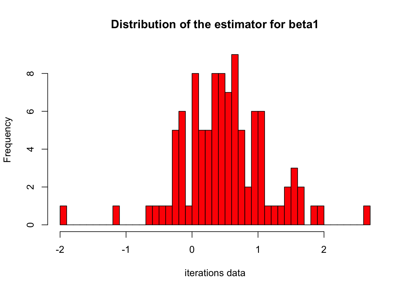
Hence we can say that for 0 to 1 estimators we have best model for price prediction from monte carlo simulations. Moreover the table above shows that for 10000 simulations our mean is around 1.9 for intercept,4.6 for beta_1 and 12.41 for beta_2. Table also shows the standard deviation for these 3 values. The mean price is estimated to be around 10000 which is far more than actual values in 100 data points. We can say that our models are not good as expected.
Question 4
First regression model
We are given with models to design. Here are applying the 1st simple linear regression model with price as dependent variable and horsepower as independent variable. Generally model is fitted on numeric data only. Before the application of model we define our two hypothesis as
Null hypothesis H0: Price is dependent upon Horsepower of the car.
Alternate hypothesis HA: Price is not dependent upon Horsepower of the car.
model  <- lm(Price~Horsepower,data=df)
summary(model)
Call:
lm(formula = Price ~ Horsepower, data = df)

Residuals:
     Min       1Q   Median       3Q      Max
-16.6809  -2.7455  -0.7629   1.8978  31.6082

Coefficients:
            Estimate Std. Error t value Pr(>|t|)
(Intercept) -1.57618    1.85586  -0.849    0.398
Horsepower   0.14686    0.01225  11.987   <2e-16 ***
---
Signif. codes:  0 '***' 0.001 '**' 0.01 '*' 0.05 '.' 0.1 ' ' 1

Residual standard error: 6 on 90 degrees of freedom
Multiple R-squared:  0.6149,    Adjusted R-squared:  0.6106
F-statistic: 143.7 on 1 and 90 DF,  p-value: < 2.2e-16
The model results show that the model is not significant since p-value is less than 0.05 for 5% significance level and 95% confidence interval. Hence the null hypothesis is rejected and alternate hypothesis is accepted which means that Price is dependent upon Horsepower of the car. From the model results, our simple linear equation can be written as follows
\[Price = \beta_0 + \beta_1*Horsepower\]
where \(\beta_0\) is the intercept and \(\beta_1\) is the coefficient of Horsepower. In our case inctercept value is -1.57 and coefficeint of horsepower is 0.146 so our equation becomes
\[Price = -1.57 + 0.146*Horsepower\]
The above equation explains that the price of the car is less than \(-1.57\) if the horsepower is less than \(0.146\) and greater than \(-1.57\) if the horsepower is greater than \(0.146\).
Our adjusted R2 value is 0.61 which shows that Price is predicted correctly 61% of the time by our model. This value is not in negative so we can say that our model is not overfitting. Moreover the F-statistics value is 143 for 90 degress of freedom which is high and it depicts that our model is efficient enough for prediction.
3 aesterics on p-value in table above show the highly significant model and it also means that price is highly dependent upon horsepower of the car. Standard error shown on the right side of intercept is low which shows our model estimates are good. The model estimates can be shown by the graphs below.
par(mfrow=c(1,1))
plot(model)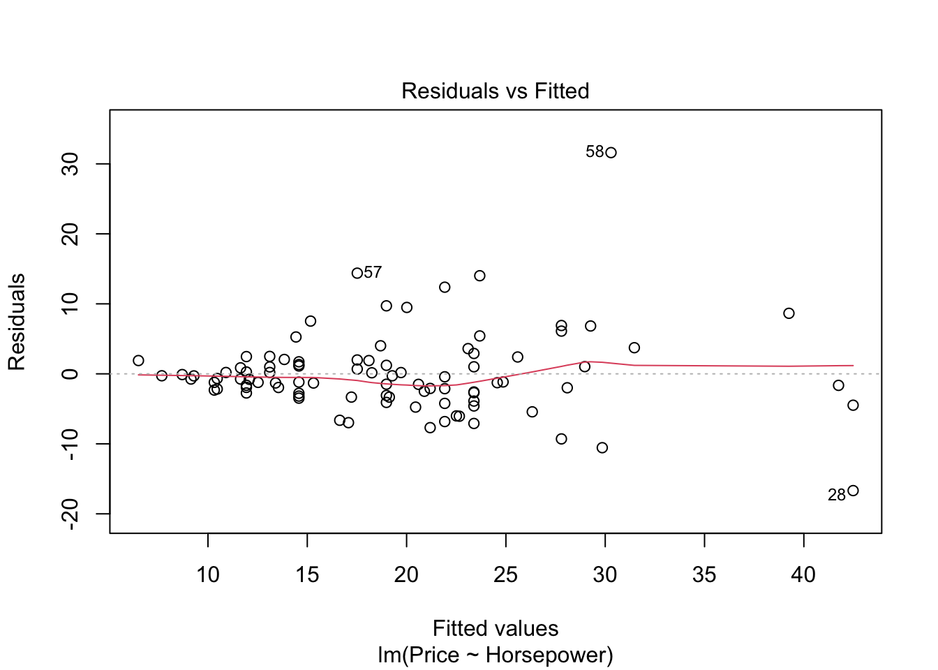
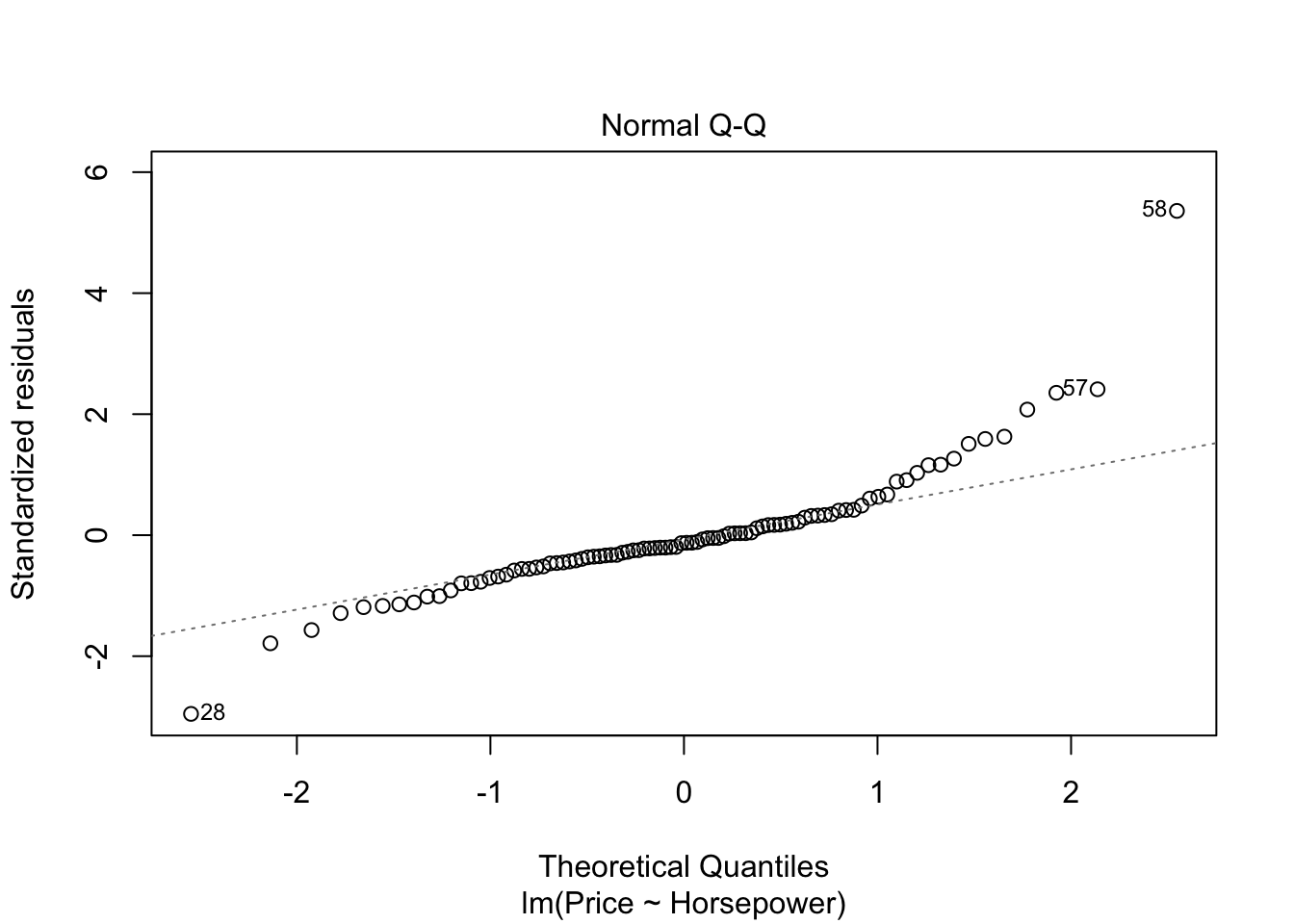
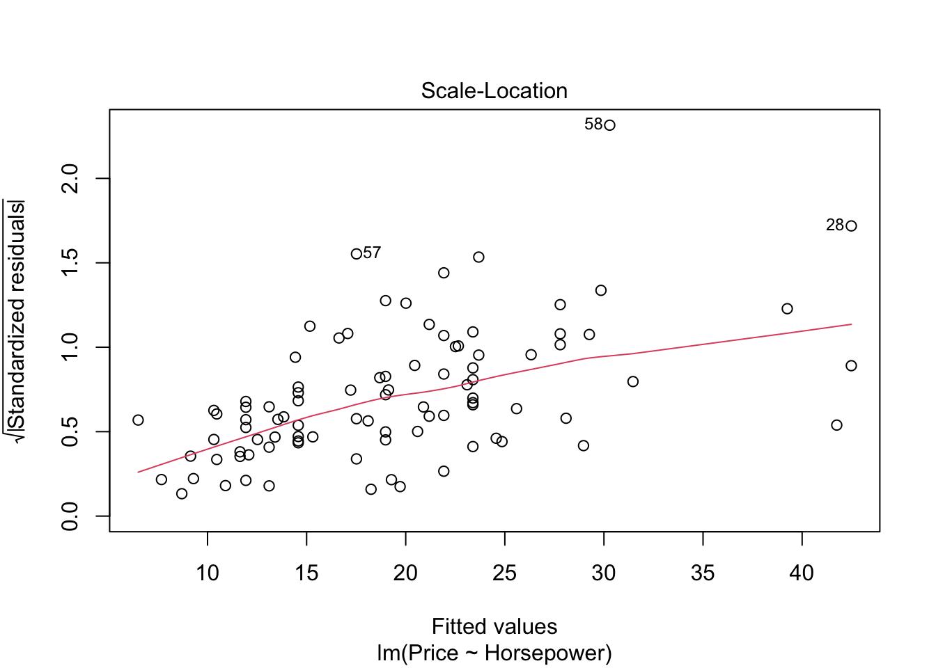
abline(lm(Price~Horsepower,data=df))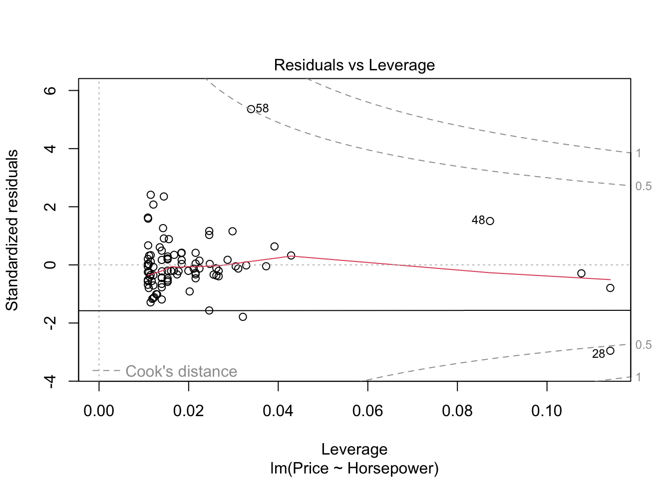
#par(mfrow=c(1,1))- The graph residuals vs leverage shows that no point lies outside the dashed cook’s distance which means that it is an all points are non-influential in the dataset.
- In scale location plot the red line is almost horizontal so we can say that assumption of equal variance is met.
- In the graph for normal qq plot the line follows the points so our residuals are almost normally distributed.
- In residuals vs fitted plot the red line follows the straight path for more than 90% of points so we can say that linear regression model is fit for cars dataset.
2nd regression model:
We were asked to apply the multiple linear regression model with more than 1 independent variable. The second independent variable in this case is MPgCity. Before the application of model we define our two hypothesis as
Null hypothesis H0: Price is dependent upon Horsepower and Miles per gallong (MPG) capacity of the car.
Alternate hypothesis HA: Price is not dependent upon Horsepower and Miles per gallong (MPG) capacity of the car.
Model is applied by using below code
model  <- lm(Price~Horsepower+MPG.city,data=df)
summary(model)
Call:
lm(formula = Price ~ Horsepower + MPG.city, data = df)

Residuals:
    Min      1Q  Median      3Q     Max
-5.8872 -0.9637 -0.0210  0.8495  4.0257

Coefficients:
             Estimate Std. Error t value Pr(>|t|)
(Intercept) -0.771579   0.513587  -1.502    0.137
Horsepower   0.022286   0.005072   4.394 3.06e-05 ***
MPG.city     0.778636   0.023597  32.997  < 2e-16 ***
---
Signif. codes:  0 '***' 0.001 '**' 0.01 '*' 0.05 '.' 0.1 ' ' 1

Residual standard error: 1.659 on 89 degrees of freedom
Multiple R-squared:  0.9709,    Adjusted R-squared:  0.9702
F-statistic:  1485 on 2 and 89 DF,  p-value: < 2.2e-16
The model results show that p-value is again highly significant with 3 aesterics which in turn means that both MPG and Horsepower are highly significant variables to predict the price of car. From the model results, our multiple linear equation can be written as follows
\[Price = \beta_0 + \beta_1*Horsepower+\beta_2*MPG.city\]
It can be written in customized form as
\[Price = -0.77 + 0.02*Horsepower + 0.77*MPG.city\]
Again the model coefficients in the above equation are very small. In the multiple linear regression model R2 value is very high and almost 1 which shows that adding more variables in the regression model can give better fit of the data. Our p-value as discussed earlier is less than 0.05 for both Horsepower and MPG and it results in rejection of null hypothesis is rejected. From the new model results we can deduce that car price is dependent upon Horsepower and Miles per gallong (MPG) capacity of the car.
F-stats value has increased largely which demonstrates that our multiple linear regression model is more efficient than simple linear regression model for prediction. F-value comparison in both models shows that null hypothesis rejection is much easier in multiple linear regression. Th estimates for horsepower have decreased in mutiple linear regression as compared to simple linear regression from 0.14 to 0.02. In the simple linear for every increase of price we have 0.14 increase of horsepower which is less in multiple linear regression which means that we take into account several variables before buying the car the price estimate does not vary that much. We can plot the model in four figures below.
par(mfrow=c(1,1))
plot(model)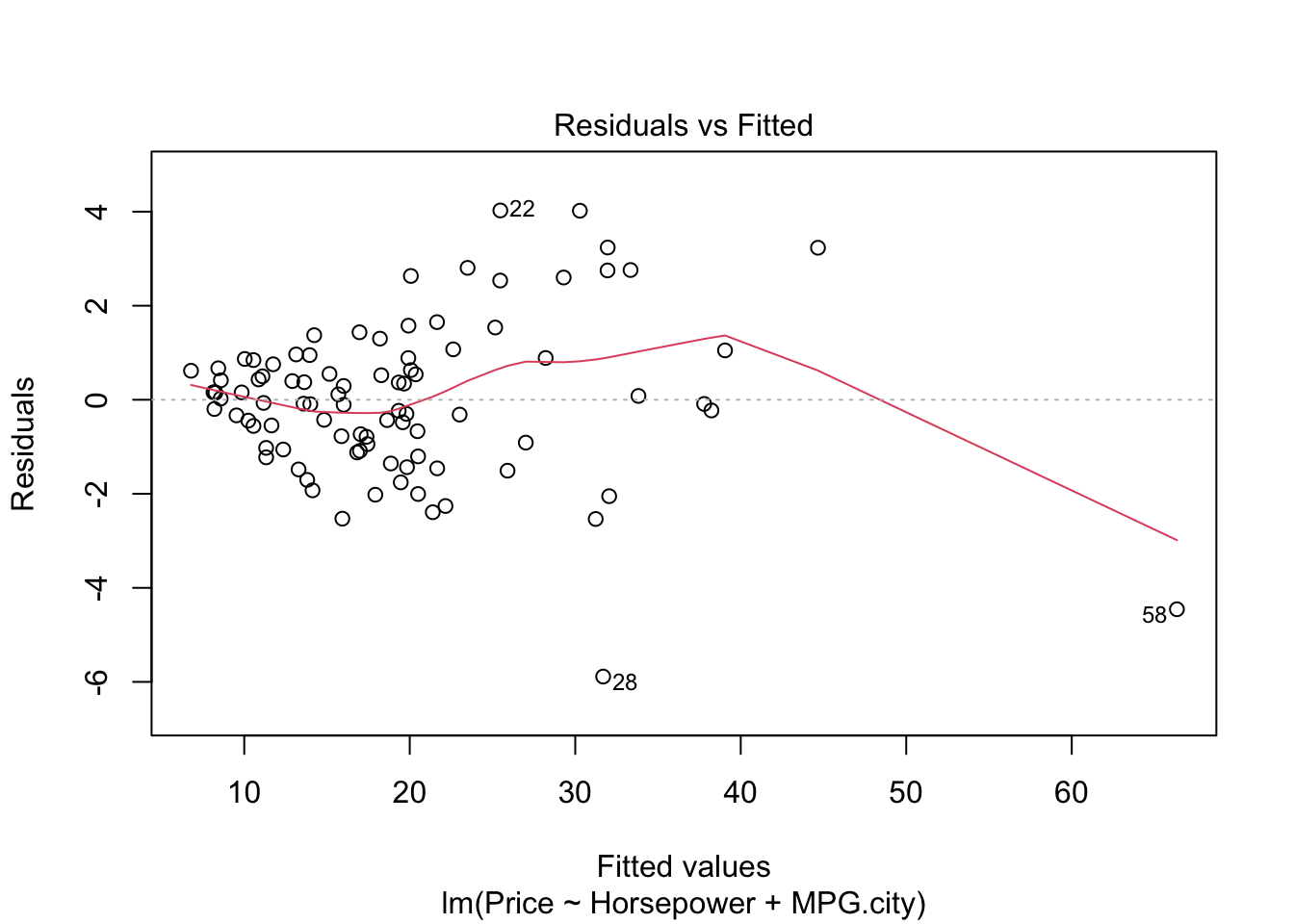
abline(lm(Price~Horsepower+MPG.city,data=df))Warning in abline(lm(Price ~ Horsepower + MPG.city, data = df)): utilisation
des deux premiers des 3 coefficients de régression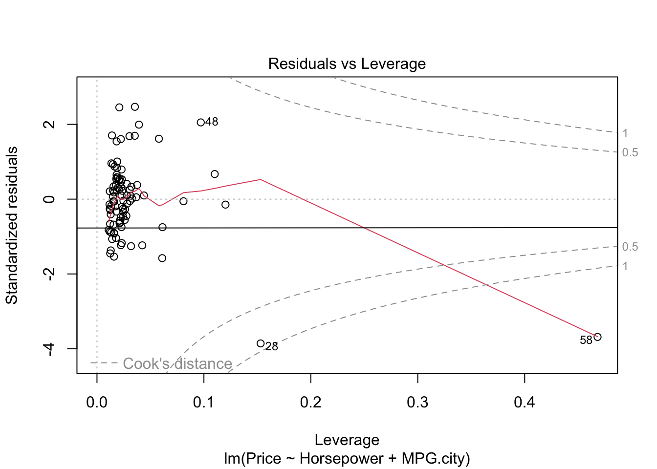
#par(mfrow=c(1,1))- The graph residuals vs leverage shows that point number 58 lies outside the dashed cook’s distance which means that it is an influential point in the dataset.
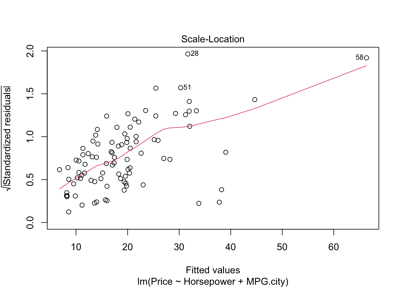
- In scale location plot the red line is almost horizontal so we can say that assumption of equal variance is likely met except for point 58.
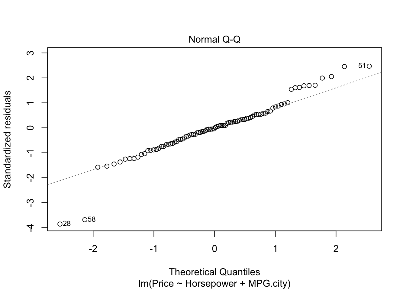
- In the graph for normal qq plot the line follows the points so our residuals are normally distributed.
- In residuals vs fitted plot the red line follows the straight path for more than 50% of points except. We cannot explicitly say that multiple linear regression model is fit for cars dataset.
Conclusion
Cars dataset was provided with 14 features. It included several variables for built in attributes which a customer takes into account while buying a car. A shiny dashboard was developed to plot the several types of plots based on input of the user. We had to take into account the plots dependence upon the type of variable selected by user as well as the linear equation of the regression model where Price was treated as dependent variable. Afterwards we developed 8192 different models by combinations of variables in the dataset. Best model was selected by running a monte carlo simulation with 100 iterations. In the final stage we compared outputs of linear and miltiple linear regression models for predicting price where horsepower and miles per gallon capacity of the car was picked as independent variables. We conclude that a customer can take into account more variables while purcashing a car keeping in mind that price does not increase exponentially in both USA and out of USA.